
Jaianto | Logo Design
クレジット
Direction
Graphic Design
Jaianto | Logo Design
WORK - Logo Design Jaianto
クライアント:Jaianto
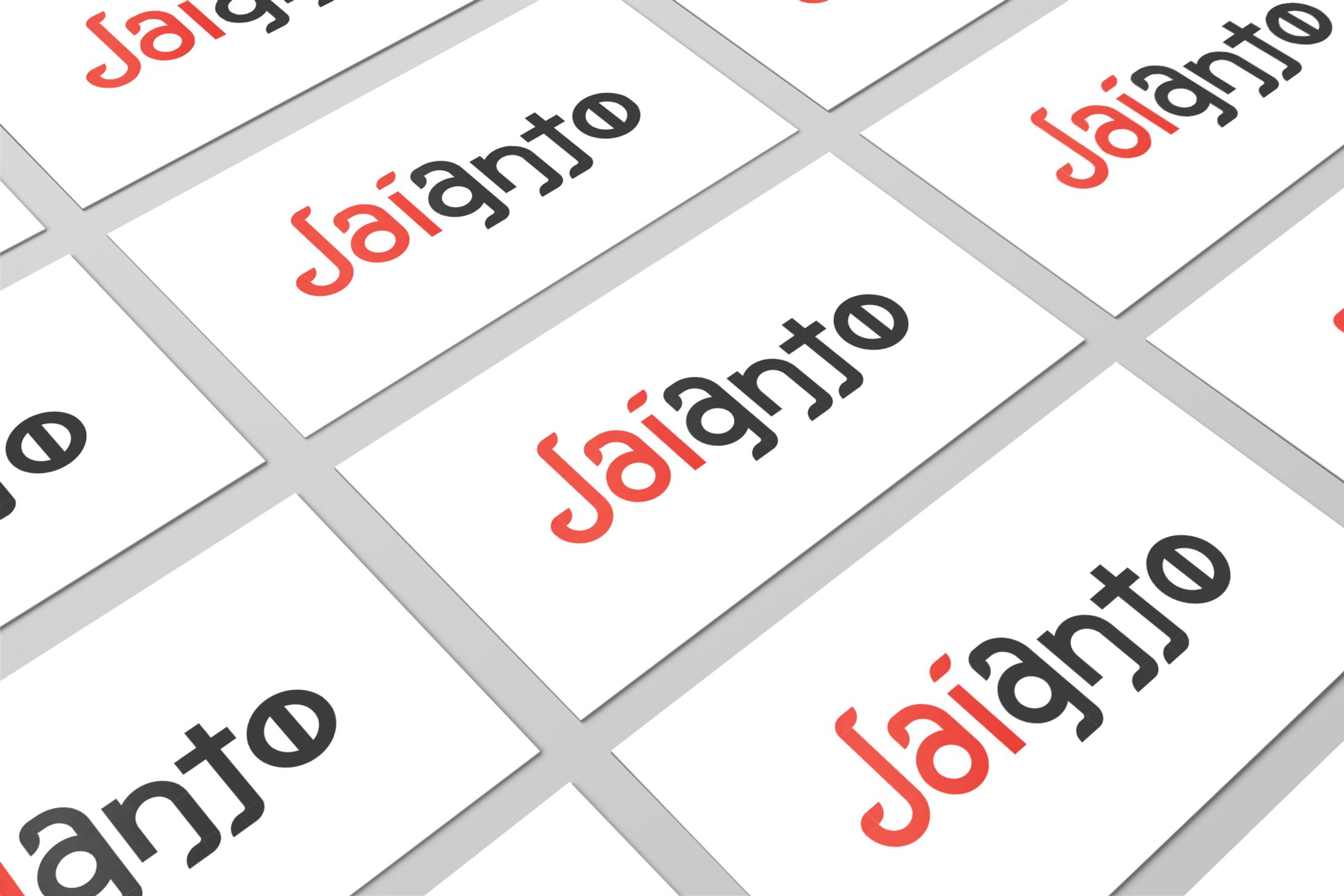
社名の巨人という言葉から、縁の下の力持ちの意味合いもあるアリをモチーフに、小さな巨人から着想を得て制作。 本来の表記はantだが、ローマ字表記のantoでアリの形になっている。 さらに、Oに縦線を入れてアリのお腹を表現し、全体に触覚をイメージした形に仕上げている。
The word "giant" in the name of the company was inspired by a small giant, using ants as a motif. The original notation is "ant," but the Romanized version of "anto" is in the shape of an ant. In addition, a vertical line is added to the "O" to represent the belly of the ant, and the overall shape is reminiscent of the sense of touch.
クレジット
Direction
Graphic Design


あなたのforiioを無料で作成
Jaianto | Logo Design
WORK - Logo Design Jaianto
クライアント:Jaianto
社名の巨人という言葉から、縁の下の力持ちの意味合いもあるアリをモチーフに、小さな巨人から着想を得て制作。 本来の表記はantだが、ローマ字表記のantoでアリの形になっている。 さらに、Oに縦線を入れてアリのお腹を表現し、全体に触覚をイメージした形に仕上げている。
The word "giant" in the name of the company was inspired by a small giant, using ants as a motif. The original notation is "ant," but the Romanized version of "anto" is in the shape of an ant. In addition, a vertical line is added to the "O" to represent the belly of the ant, and the overall shape is reminiscent of the sense of touch.
クレジット
Direction
Graphic Design