【ポスター】パーソナルカラー
クレジット

グラフィックデザイナー
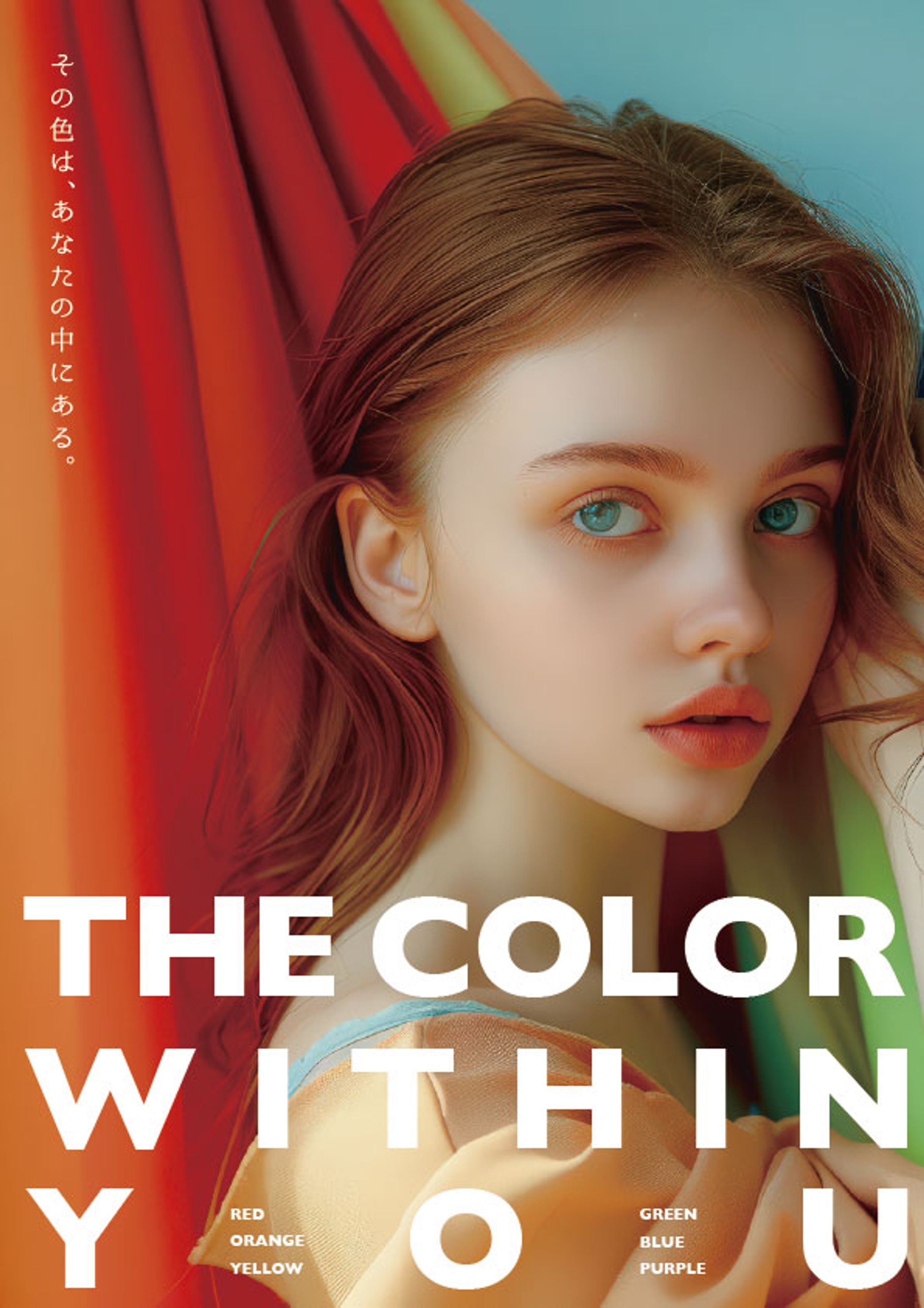
Personal Color Poster ー 光の中で出会う、わたしの色。

デザイン書を参考に構成やタイポグラフィを学びながら、
パーソナルカラーをテーマに再構成したポスター作品です。
柔らかな光と色彩のグラデーションを通して、
「似合う色=心の奥にある本来の輝き」を表現しました。
英語タイトルと日本語コピーを調和させ、
静けさの中に温かさを感じるデザインを目指しています。
This poster was created as a reinterpretation inspired by a design reference book.
The theme focuses on personal color — expressing the inner light and natural harmony within oneself.
Through soft light, subtle gradients, and balanced typography,
it conveys the idea that “the color that suits you is already inside you.”


fori.io/
fori.io/