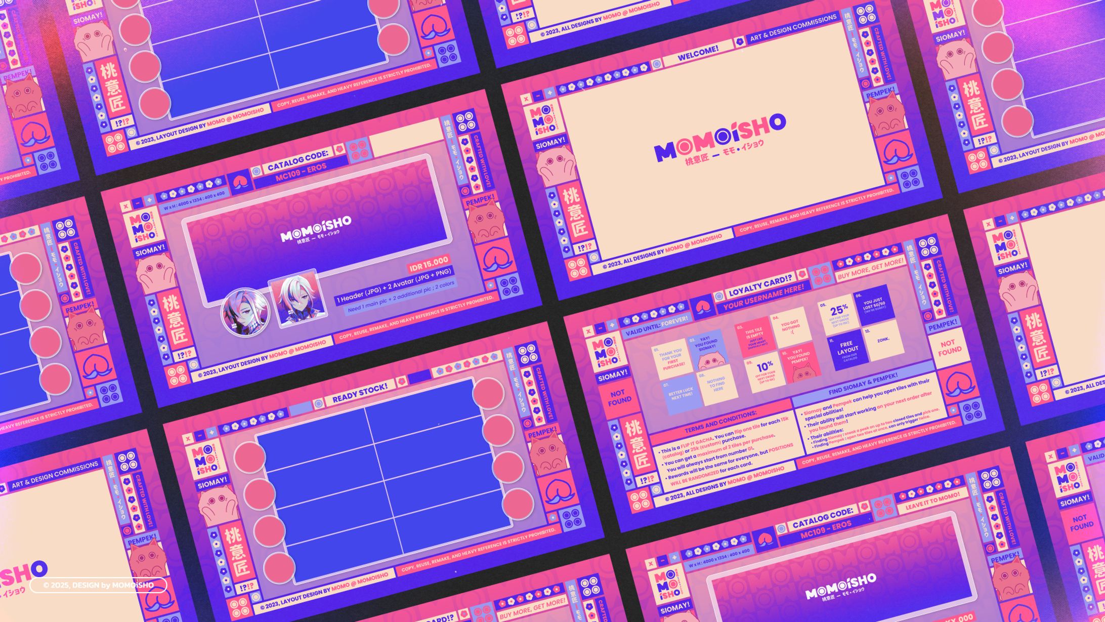
MOMOiSHO - 2023 Set Up & Branding

The name MOMOISHO (桃意匠) is a combination of the word MOMO (桃) that means "Peach" and ISHO (意匠) that means "Design". Combined together, it aims to symbolizes a peachy designer in action.
Peach on its own is both very sweet and has a bit of tanginess on it; hard when it's unripe but came out soft when it does; and plump in appearance. It fits my personality as a person and a designer, in which i offer not just sweetness and care with my services, but also uniqueness to each of my designs.
The vibrant pink, blue, and purple colors and cute elements reflect my loud and bold personality, showcasing how I want my work to be perceived. They embody a blend of confidence and playfulness, capturing how I aim to charm people with my creations. In order to balance it out and not leave it messy, i kept the layout neat with a clean margin and organized layouts, despite the elements' different sizes.
The "i" in MOMOiSHO were kept in lowercase to remind myself that "i" am still a small being in this world and there's always a lot of room to grow.
Self reflect & review:
I personally think the design shows too much happening in one go, where layouts that are supposed to be the main focus got overpowered. It is then failed to show its purpose.