
LP Creation: Co-working Space "WORK lounge AOYAMA" / LP制作:コワーキングスペース「WORK lounge AOYAMA」
クレジット
デザイナー
LP Creation: Co-working Space "WORK lounge AOYAMA" / LP制作:コワーキングスペース「WORK lounge AOYAMA」
A landing page design for a high-end co-working space in Aoyama, created as a project for the SHElikes PRO Designer course. The objective was to design a platform that attracts professionals seeking a "natural yet sophisticated" workspace, bridging the gap between work and comfort.
SHElikes PRO デザイナーコースの課題として、青山にあるハイエンドなコワーキングスペースのLPをデザインしました。「ナチュラルかつ上質」な空間を求めるプロフェッショナルをターゲットに、仕事と心地よさの調和を感じさせるプラットフォームの構築を目的としました。
[ Design Process & Strategy / 制作プロセスと戦略 ]
■ Concept & Visual Identity / コンセプトとビジュアル
Visual Theme: Based on the mood board, I defined the keywords as "Natural," "Fine Quality," and "Simple". /
Imagery: I selected photography that conveys both a professional atmosphere and a sense of community, ensuring it aligns with the target audience's aspirations. / ターゲットの志向に合わせ、プロフェッショナルな雰囲気とコミュニティの温かさの両方を伝える写真を厳選しています。
■ Colour & Typography / 配色とタイポグラフィ
Strategic Palette: Utilised earthy greens and warm neutrals to reflect the "Natural" concept while maintaining a premium feel. / 「ナチュラル」なコンセプトを反映するため、アースカラーのグリーンと温かみのあるニュートラルカラーを採用し、上質な印象を維持しました。
Typography: Selected clean, modern typefaces to ensure a professional look that appeals to business users in the Aoyama area. / 青山エリアのビジネスユーザーに響くよう、クリーンでモダンな書体を選定しています。
■ Information Architecture / 情報設計
User Journey: Designed a logical flow that starts with an emotional "Concept" section to inspire users, followed by practical details such as "Features", "Facilities", "Location", and "Pricing Plans". / ユーザーの感性に訴えかける「コンセプト」から始まり、「特徴」「施設・設備」「ロケーション」「プラン」といった実用的な情報を配置することで、スムーズな意思決定を促す動線を設計しました。
Accessibility: Created a clear FAQ section and access map to address common user queries and lower the barrier to visiting the lounge. / よくある質問やアクセスマップも整備し、来店の心理的ハードルを下げる工夫をしています。
4. Project Details / 制作詳細
Tools: Photoshop / 使用ツール:Photoshop
クレジット
デザイナー


あなたのforiioを無料で作成
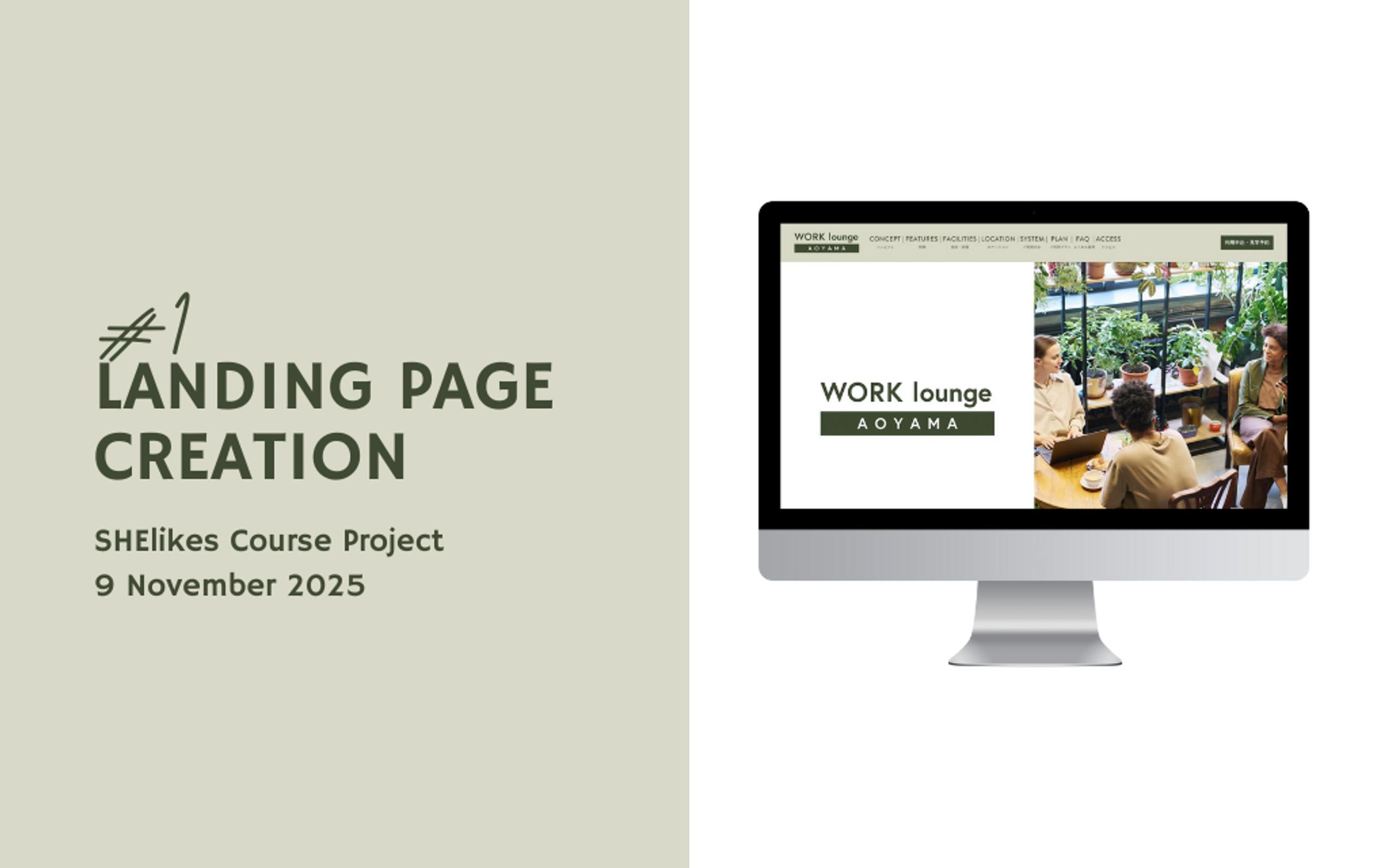
LP Creation: Co-working Space "WORK lounge AOYAMA" / LP制作:コワーキングスペース「WORK lounge AOYAMA」
A landing page design for a high-end co-working space in Aoyama, created as a project for the SHElikes PRO Designer course. The objective was to design a platform that attracts professionals seeking a "natural yet sophisticated" workspace, bridging the gap between work and comfort.
SHElikes PRO デザイナーコースの課題として、青山にあるハイエンドなコワーキングスペースのLPをデザインしました。「ナチュラルかつ上質」な空間を求めるプロフェッショナルをターゲットに、仕事と心地よさの調和を感じさせるプラットフォームの構築を目的としました。
[ Design Process & Strategy / 制作プロセスと戦略 ]
■ Concept & Visual Identity / コンセプトとビジュアル
Visual Theme: Based on the mood board, I defined the keywords as "Natural," "Fine Quality," and "Simple". /
Imagery: I selected photography that conveys both a professional atmosphere and a sense of community, ensuring it aligns with the target audience's aspirations. / ターゲットの志向に合わせ、プロフェッショナルな雰囲気とコミュニティの温かさの両方を伝える写真を厳選しています。
■ Colour & Typography / 配色とタイポグラフィ
Strategic Palette: Utilised earthy greens and warm neutrals to reflect the "Natural" concept while maintaining a premium feel. / 「ナチュラル」なコンセプトを反映するため、アースカラーのグリーンと温かみのあるニュートラルカラーを採用し、上質な印象を維持しました。
Typography: Selected clean, modern typefaces to ensure a professional look that appeals to business users in the Aoyama area. / 青山エリアのビジネスユーザーに響くよう、クリーンでモダンな書体を選定しています。
■ Information Architecture / 情報設計
User Journey: Designed a logical flow that starts with an emotional "Concept" section to inspire users, followed by practical details such as "Features", "Facilities", "Location", and "Pricing Plans". / ユーザーの感性に訴えかける「コンセプト」から始まり、「特徴」「施設・設備」「ロケーション」「プラン」といった実用的な情報を配置することで、スムーズな意思決定を促す動線を設計しました。
Accessibility: Created a clear FAQ section and access map to address common user queries and lower the barrier to visiting the lounge. / よくある質問やアクセスマップも整備し、来店の心理的ハードルを下げる工夫をしています。
4. Project Details / 制作詳細
Tools: Photoshop / 使用ツール:Photoshop
クレジット
デザイナー