
Banner Design: Refer-a-Friend Campaign for English School / バナー制作:英会話スクールお友達紹介キャンペーン
クレジット
デザイナー
Banner Design: Refer-a-Friend Campaign for English School / バナー制作:英会話スクールお友達紹介キャンペーン
A promotional banner designed for a (hypothetical) English language school's summer referral campaign, created as part of the SHElikes design course. The objective was to attract women in their 20s and encourage them to join the school with their friends by conveying a bright, approachable, and "summery" atmosphere.
SHElikesのデザインコースの一環として制作した、英会話スクールの夏のお友達紹介キャンペーンバナーです。20代の女性をターゲットに、明るく親しみやすい「夏らしさ」を伝えることで、友人同士での入会を促すことを目的としました。
[ Design Strategy / デザイン戦略 ]
■ Colour Palette / 配色
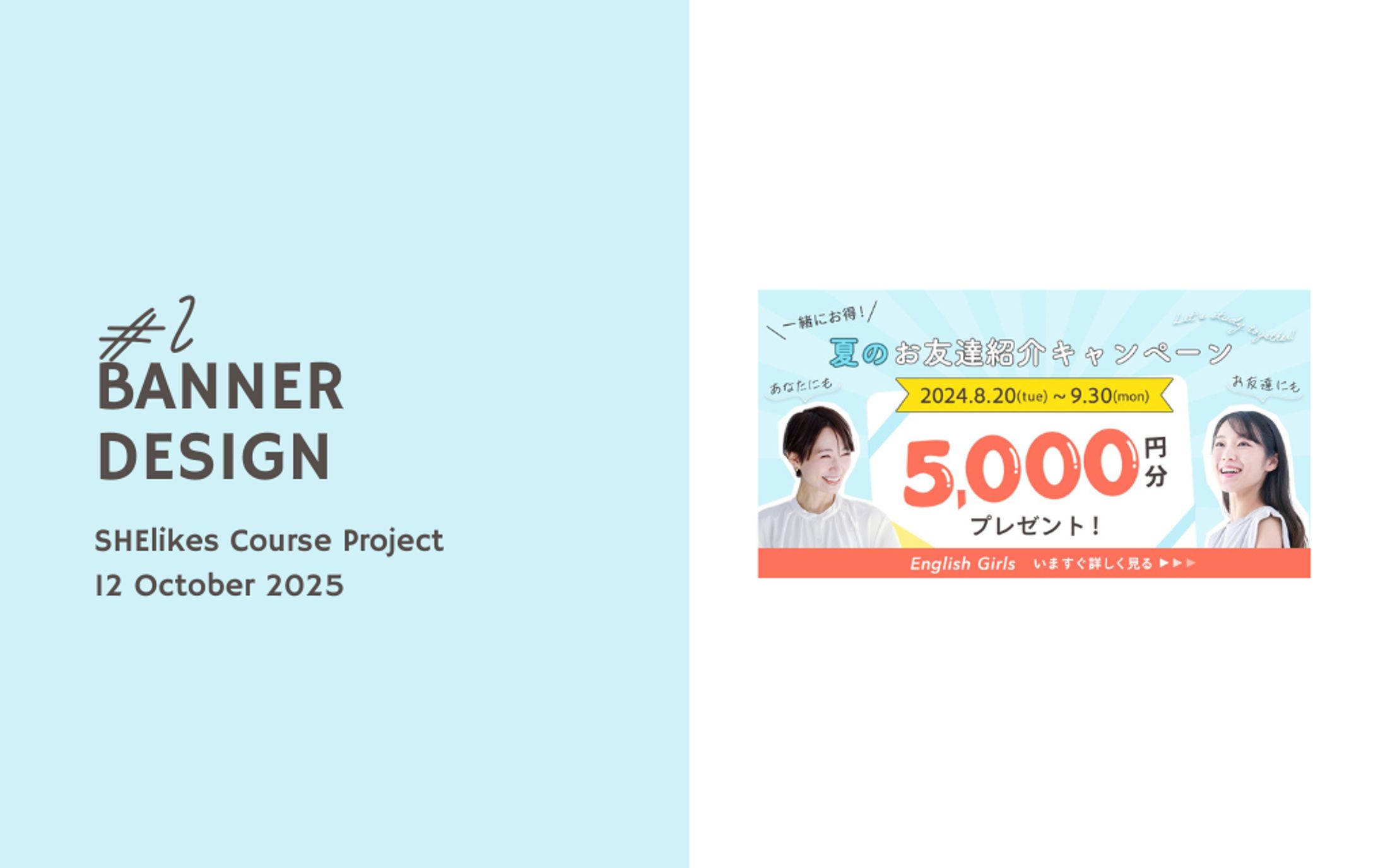
Analysis: The palette uses light blue and white as base colours to evoke a refreshing summer feel. Vibrant orange and yellow are used as accent colours to add a pop, energetic, and cheerful vibe to the overall design. / 水色と白色をベースカラーに、涼しげな夏を演出しました。アクセントカラーにオレンジと黄色を使用し、明るくポップでエネルギッシュな雰囲気を持たせています。
■ Information Design / 情報設計
Strategic Layout: To enhance the user journey, the "Refer-a-Friend" message and the "5,000 Yen" reward are prominently displayed as the primary focal points. / ユーザーストーリーを考慮し、「お友達紹介」と「5,000円分」という特典を最も目立たせる構成にしました。
■ Visual & Typography / ビジュアルとタイポグラフィ
Emphasis: A white background was added behind the female models to separate them from the background, ensuring they stand out. For the number "5", I used the pen tool to create a soft, rounded texture. / 人物写真の背後に白背景を追加し、背景から分離させて視認性を高めました。「5」の数字にはペンツールを使用し、ふんわりとした質感を表現しています。
Typography: I selected rounded fonts to create a gentle and welcoming impression, suitable for a female-focused service, while maintaining high readability. / フォントは、女性向けサービスに合う柔らかい印象の角丸のものを選びました。
[ Project Details / 制作詳細 ]
Production Time: 200 minutes / 制作時間:200分
Tools: Photoshop / 使用ツール:Photoshop
クレジット
デザイナー


あなたのforiioを無料で作成
Banner Design: Refer-a-Friend Campaign for English School / バナー制作:英会話スクールお友達紹介キャンペーン
A promotional banner designed for a (hypothetical) English language school's summer referral campaign, created as part of the SHElikes design course. The objective was to attract women in their 20s and encourage them to join the school with their friends by conveying a bright, approachable, and "summery" atmosphere.
SHElikesのデザインコースの一環として制作した、英会話スクールの夏のお友達紹介キャンペーンバナーです。20代の女性をターゲットに、明るく親しみやすい「夏らしさ」を伝えることで、友人同士での入会を促すことを目的としました。
[ Design Strategy / デザイン戦略 ]
■ Colour Palette / 配色
Analysis: The palette uses light blue and white as base colours to evoke a refreshing summer feel. Vibrant orange and yellow are used as accent colours to add a pop, energetic, and cheerful vibe to the overall design. / 水色と白色をベースカラーに、涼しげな夏を演出しました。アクセントカラーにオレンジと黄色を使用し、明るくポップでエネルギッシュな雰囲気を持たせています。
■ Information Design / 情報設計
Strategic Layout: To enhance the user journey, the "Refer-a-Friend" message and the "5,000 Yen" reward are prominently displayed as the primary focal points. / ユーザーストーリーを考慮し、「お友達紹介」と「5,000円分」という特典を最も目立たせる構成にしました。
■ Visual & Typography / ビジュアルとタイポグラフィ
Emphasis: A white background was added behind the female models to separate them from the background, ensuring they stand out. For the number "5", I used the pen tool to create a soft, rounded texture. / 人物写真の背後に白背景を追加し、背景から分離させて視認性を高めました。「5」の数字にはペンツールを使用し、ふんわりとした質感を表現しています。
Typography: I selected rounded fonts to create a gentle and welcoming impression, suitable for a female-focused service, while maintaining high readability. / フォントは、女性向けサービスに合う柔らかい印象の角丸のものを選びました。
[ Project Details / 制作詳細 ]
Production Time: 200 minutes / 制作時間:200分
Tools: Photoshop / 使用ツール:Photoshop
クレジット
デザイナー