
Logotype Collection-1
クレジット
3D Designer
Logotype Collection-1
°— Escort isn't your average name; think of it as this group got its own style, knows things, and operates kinda low-key. I wanted each logo to feel like a secret handshake – something everyone sees, but only certain people really get.
For Hit and Play (01), I went for something energetic and a bit wild. Like, imagine a glitchy screen or something colourful and chaotic just doing its own thing. It's loud and doesn't really follow any rules.
Bunny Outside (02) is softer, maybe a bit more mysterious. Picture some cool street art you'd find on the edge of town, maybe with a bit of neon glow. Looks kinda playful, but there's definitely a rebellious side hiding in there.
And ESCT (03) That one's tougher, more industrial. Think sharp lines, maybe a bit dark and intense, like that feeling you get walking down an empty city street late at night.
Each logo is just a piece of that story – something designed to catch your eye, make you look twice, and hopefully stick in your head for a bit.
クレジット
3D Designer

![[FOR SALE] Golden Glide](https://img.foriio.com/images/store/a4bd9d93d2fc2d844b4d2221803efaad.gif?ixlib=rb-4.1.1&auto=compress&w=688&h=424&fit=max&facepad=10&fm=gif&bg=FFFFFF&frame=-&gif-q=80&skip=3&s=2e81ddbd53ceaec4f3af9e5ff07c1edb)

あなたのforiioを無料で作成
Logotype Collection-1
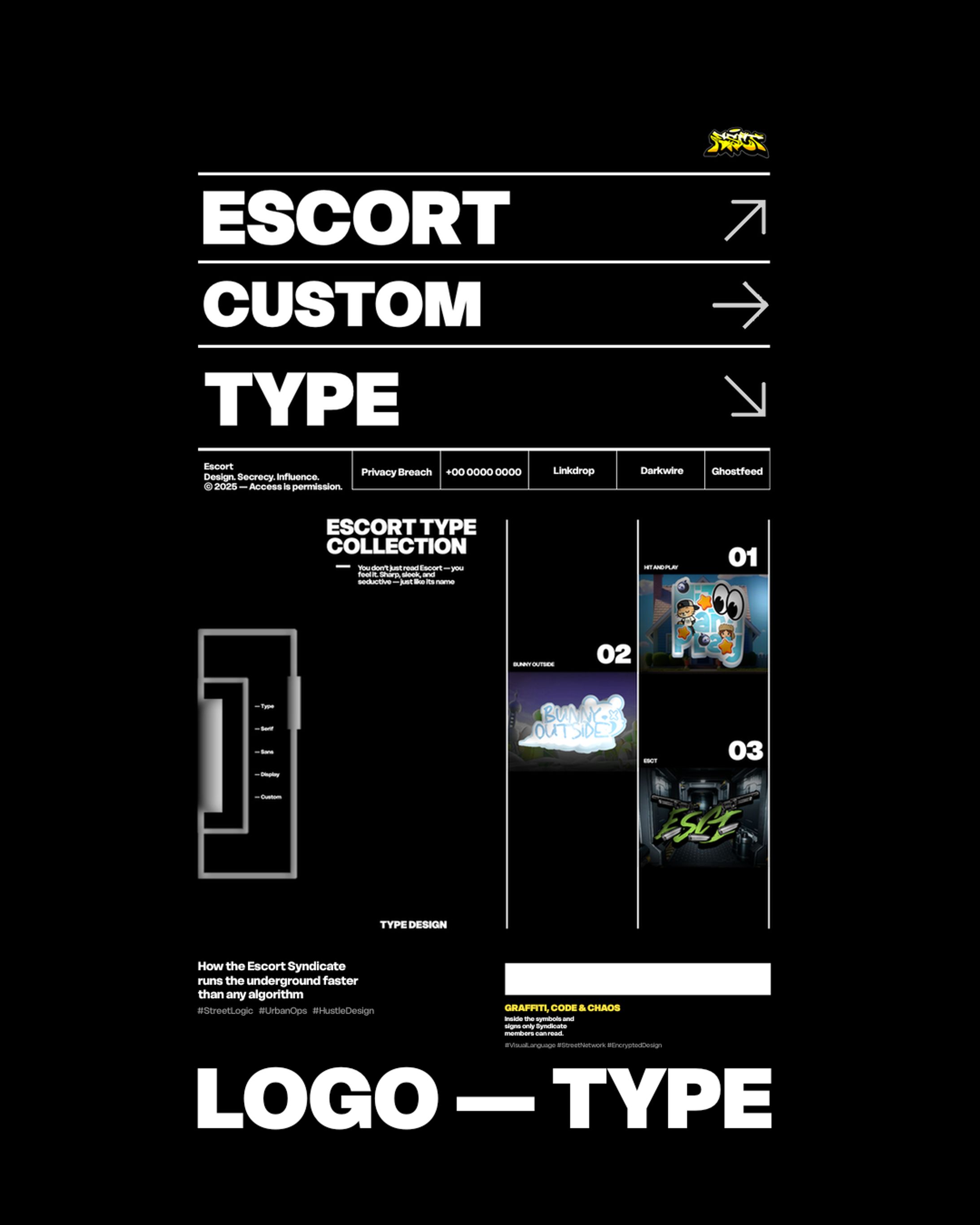
°— Escort isn't your average name; think of it as this group got its own style, knows things, and operates kinda low-key. I wanted each logo to feel like a secret handshake – something everyone sees, but only certain people really get.
For Hit and Play (01), I went for something energetic and a bit wild. Like, imagine a glitchy screen or something colourful and chaotic just doing its own thing. It's loud and doesn't really follow any rules.
Bunny Outside (02) is softer, maybe a bit more mysterious. Picture some cool street art you'd find on the edge of town, maybe with a bit of neon glow. Looks kinda playful, but there's definitely a rebellious side hiding in there.
And ESCT (03) That one's tougher, more industrial. Think sharp lines, maybe a bit dark and intense, like that feeling you get walking down an empty city street late at night.
Each logo is just a piece of that story – something designed to catch your eye, make you look twice, and hopefully stick in your head for a bit.
クレジット
3D Designer