
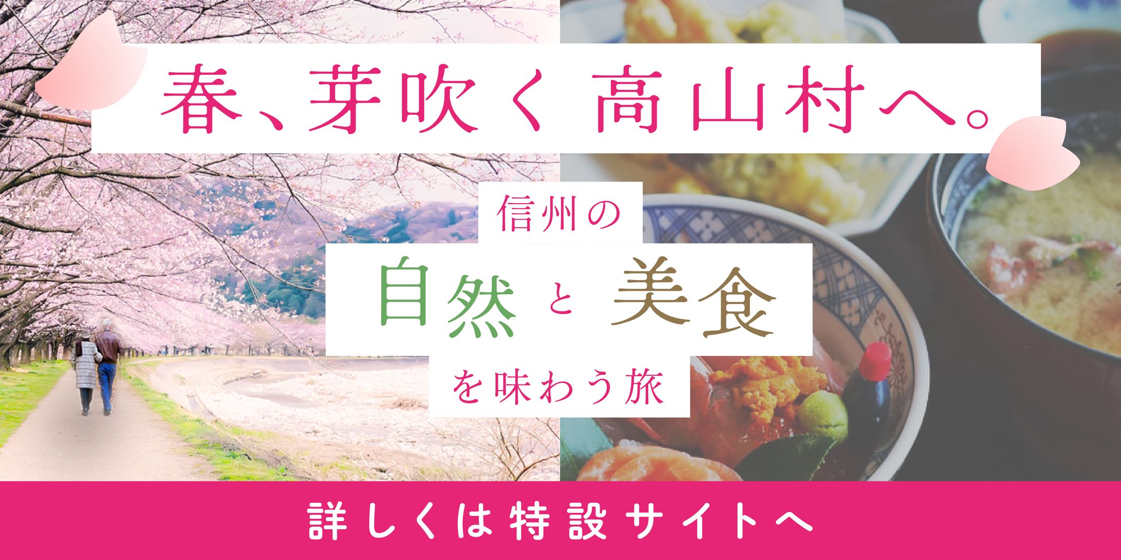
“Web Banner: To Takayama Village, Where Spring Blooms.”
クレジット

UI Designer
UX Designer
“Web Banner: To Takayama Village, Where Spring Blooms.”
About the Design
Production Period: 1 day
Tools/Skills:
• Illustrator
• Photoshop
• ChatGPT
• Perplexity AI
• UI/UX
• Branding
• Marketing
Commitment Points:
1. To promote the charm of Takayama Village:
• Research showed that travelers to Nagano Prefecture seek “nature and local food.” (Not specific to Takayama Village, but used as a reference.)
• To highlight nature and local food, I composed the design using two contrasting photos (nature on the left, food on the right), emphasizing contrast by using white on the left and black on the right.
• Differentiated the font color and positioning to make key messages stand out.
2. To express the feeling of spring:
• Used pink as the main color.
• Decorated the design with cherry blossom illustrations.
• Enhanced the saturation of the “pink and green” areas in the cherry blossom path photo using Photoshop.
3. To convey a sense of relaxation and healing:
• Increased letter spacing (tracking) for a more airy and relaxed feel.
4. Considering the target audience of married couples and partners:
• Cut out an image of a couple with Photoshop, added shadows, and placed them into the cherry blossom photo.
5. To address the low resolution of the cherry blossom photo:
• Lowered clarity and slightly blurred the image to create a “spring haze” effect and mask imperfections.
6. To convey elegance and purity:
• Used Mincho-style (serif) fonts for the main text.
• Used rounded Gothic fonts for the CTA (Call To Action).
• Placed the text on rectangular banners to add emphasis.
7. To highlight the CTA:
• Used a pink banner to create a strong color contrast and draw attention.
8. Overall Concept:
• Since “elegance” and “spring-like vibrancy” are somewhat contrasting images, I intentionally emphasized this contrast to create a visually striking banner.
• The left photo represents “white × spring vibrancy,” while the right photo represents “black × elegance.”
• I believe this banner successfully conveys the emotions we want the target audience to feel — “relaxation and comfort” — while identifying areas for future improvement.
⸻
Production Process
1. Define the project challenge
2. Extract keywords (to inspire design ideas)
3. Understand the market (travel) through statistics and surveys
4. Deeply research the target audience (again using statistics and surveys)
5. Create the textual content (copywriting for slogans and CTAs)
6. Brainstorm design ideas (layout, visuals, fonts, colors from design galleries and keywords)
7. Create wireframes
8. Design and polish the visuals
9. Finalize
⸻
Project Details
Target Audience:
• Travel-loving couples in their 30s to 50s
• People interested in nature, hot springs, and gourmet food
• Residents of metropolitan areas (Tokyo, Saitama, Kanagawa, etc.)
Concept:
• A journey to enjoy the nature and fine cuisine of Shinshu (Nagano Prefecture)
Purpose:
• Announce the spring tourism campaign (aimed at Golden Week)
• Promote the unique charms of Takayama Village
Feelings We Want to Evoke:
• A sense of spaciousness and relaxation
• Emotional healing
Mood:
• Natural
• Spring-like
• Gentle
• Pure
• Elegant
• Relaxed
• Makes you want to take a deep breath
• Warm
⸻
Thoughts on Design
“I want to convey love through design — and help others express it.”
I love designing while always thinking about how users will feel:
• Easy to use!
• Easy to understand!
• Exciting!
I believe that “considering people’s feelings in every aspect of design” is our true work as humans and one of life’s greatest joys.
That’s why I put the most emphasis on “getting to know the people” behind the project.
⸻
Note:
This is a fictional campaign. The photos used are for illustrative purposes only.
クレジット
UI Designer
UX Designer


あなたのforiioを無料で作成
“Web Banner: To Takayama Village, Where Spring Blooms.”
About the Design
Production Period: 1 day
Tools/Skills:
• Illustrator
• Photoshop
• ChatGPT
• Perplexity AI
• UI/UX
• Branding
• Marketing
Commitment Points:
1. To promote the charm of Takayama Village:
• Research showed that travelers to Nagano Prefecture seek “nature and local food.” (Not specific to Takayama Village, but used as a reference.)
• To highlight nature and local food, I composed the design using two contrasting photos (nature on the left, food on the right), emphasizing contrast by using white on the left and black on the right.
• Differentiated the font color and positioning to make key messages stand out.
2. To express the feeling of spring:
• Used pink as the main color.
• Decorated the design with cherry blossom illustrations.
• Enhanced the saturation of the “pink and green” areas in the cherry blossom path photo using Photoshop.
3. To convey a sense of relaxation and healing:
• Increased letter spacing (tracking) for a more airy and relaxed feel.
4. Considering the target audience of married couples and partners:
• Cut out an image of a couple with Photoshop, added shadows, and placed them into the cherry blossom photo.
5. To address the low resolution of the cherry blossom photo:
• Lowered clarity and slightly blurred the image to create a “spring haze” effect and mask imperfections.
6. To convey elegance and purity:
• Used Mincho-style (serif) fonts for the main text.
• Used rounded Gothic fonts for the CTA (Call To Action).
• Placed the text on rectangular banners to add emphasis.
7. To highlight the CTA:
• Used a pink banner to create a strong color contrast and draw attention.
8. Overall Concept:
• Since “elegance” and “spring-like vibrancy” are somewhat contrasting images, I intentionally emphasized this contrast to create a visually striking banner.
• The left photo represents “white × spring vibrancy,” while the right photo represents “black × elegance.”
• I believe this banner successfully conveys the emotions we want the target audience to feel — “relaxation and comfort” — while identifying areas for future improvement.
⸻
Production Process
1. Define the project challenge
2. Extract keywords (to inspire design ideas)
3. Understand the market (travel) through statistics and surveys
4. Deeply research the target audience (again using statistics and surveys)
5. Create the textual content (copywriting for slogans and CTAs)
6. Brainstorm design ideas (layout, visuals, fonts, colors from design galleries and keywords)
7. Create wireframes
8. Design and polish the visuals
9. Finalize
⸻
Project Details
Target Audience:
• Travel-loving couples in their 30s to 50s
• People interested in nature, hot springs, and gourmet food
• Residents of metropolitan areas (Tokyo, Saitama, Kanagawa, etc.)
Concept:
• A journey to enjoy the nature and fine cuisine of Shinshu (Nagano Prefecture)
Purpose:
• Announce the spring tourism campaign (aimed at Golden Week)
• Promote the unique charms of Takayama Village
Feelings We Want to Evoke:
• A sense of spaciousness and relaxation
• Emotional healing
Mood:
• Natural
• Spring-like
• Gentle
• Pure
• Elegant
• Relaxed
• Makes you want to take a deep breath
• Warm
⸻
Thoughts on Design
“I want to convey love through design — and help others express it.”
I love designing while always thinking about how users will feel:
• Easy to use!
• Easy to understand!
• Exciting!
I believe that “considering people’s feelings in every aspect of design” is our true work as humans and one of life’s greatest joys.
That’s why I put the most emphasis on “getting to know the people” behind the project.
⸻
Note:
This is a fictional campaign. The photos used are for illustrative purposes only.
クレジット
UI Designer
UX Designer