
"Silver Linings" | CD / VI設計 / Flyer Design
クレジット
Graphic Design
Direction
"Silver Linings" | CD / VI設計 / Flyer Design
Silver Linings CD / VI設計[Logo] / Flyer Design - Work
クライアント : Silver Linings
Silver Liningsというヴィジュアル系バンドのCD の装丁。曲名のイメージとサイバー感がほしいとの要望だったので、光の放出と時計を使って時間の失われていく様子を表現しました。背景を宇宙空間にして、サイバー感と相対性理論の意味合いも含めてみました。
■ Silver Linings というヴィジュアル系バンドのロゴを制作しました。 バンド名通り、銀の文字で高級感を出し、青い光と鳥で爽やかさを出しています。
This is the binding for a CD by a visual-kei band called Silver Linings. The band wanted the image of the song title and a cyber feel, so I used light emissions and clocks to represent the loss of time. I also tried to include the meaning of the cyber sense and the theory of relativity by using outer space as the background.
▪I created a logo for a visual-kei band called Silver Linings. As the band's name suggests, the silver letters give the logo a luxurious feel, while the blue lights and birds give it a refreshing feel.
クレジット
Graphic Design
Direction


あなたのforiioを無料で作成
"Silver Linings" | CD / VI設計 / Flyer Design
Silver Linings CD / VI設計[Logo] / Flyer Design - Work
クライアント : Silver Linings
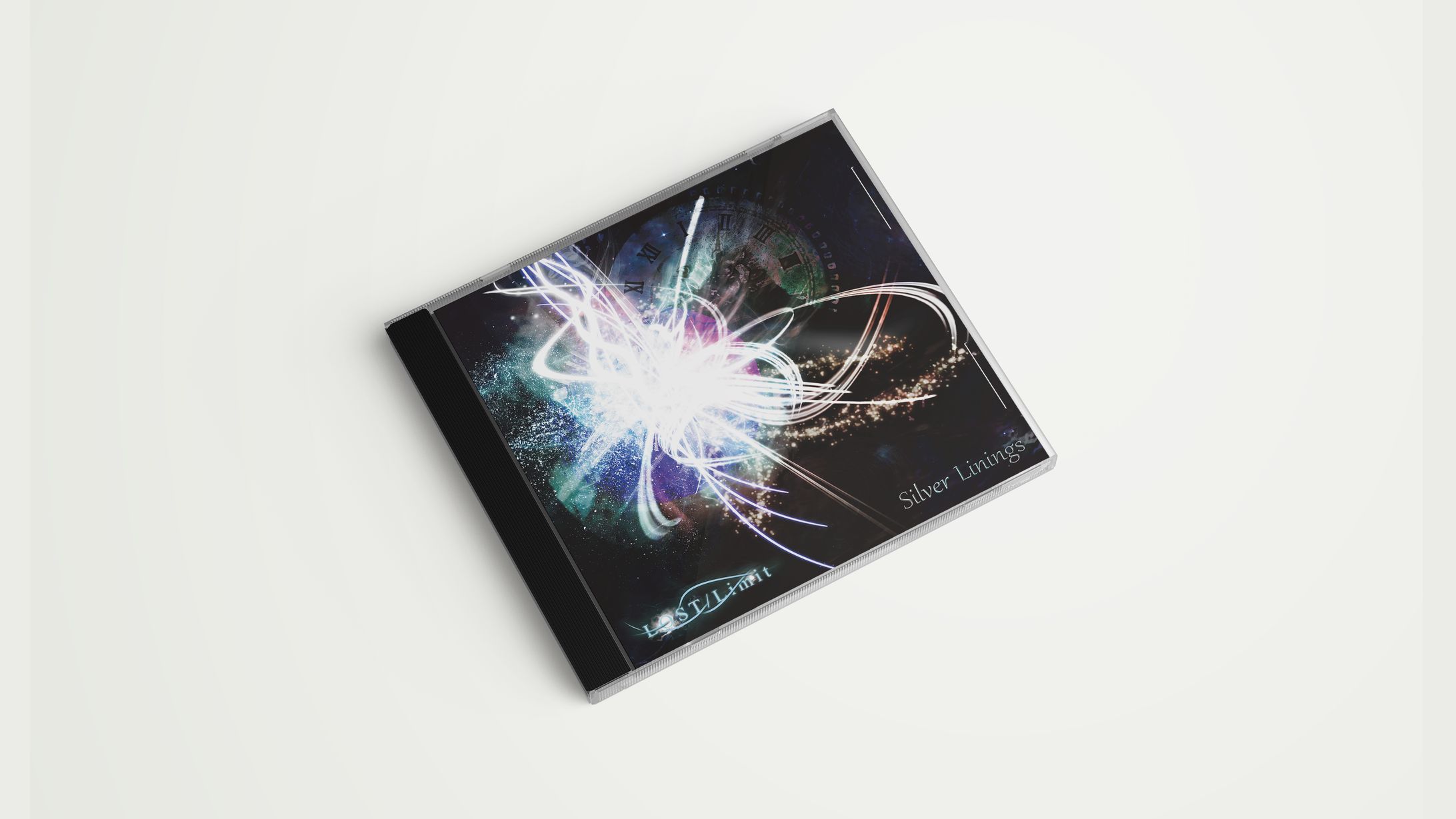
Silver Liningsというヴィジュアル系バンドのCD の装丁。曲名のイメージとサイバー感がほしいとの要望だったので、光の放出と時計を使って時間の失われていく様子を表現しました。背景を宇宙空間にして、サイバー感と相対性理論の意味合いも含めてみました。
■ Silver Linings というヴィジュアル系バンドのロゴを制作しました。 バンド名通り、銀の文字で高級感を出し、青い光と鳥で爽やかさを出しています。
This is the binding for a CD by a visual-kei band called Silver Linings. The band wanted the image of the song title and a cyber feel, so I used light emissions and clocks to represent the loss of time. I also tried to include the meaning of the cyber sense and the theory of relativity by using outer space as the background.
▪I created a logo for a visual-kei band called Silver Linings. As the band's name suggests, the silver letters give the logo a luxurious feel, while the blue lights and birds give it a refreshing feel.
クレジット
Graphic Design
Direction