
Branding design : Orchestra Zircon
クレジット

デザイナー
イラストレーター
Branding design : Orchestra Zircon
I was in charge of designing all aspects, including logos, flyers, and brochures, from the inception of the orchestra.
To express the concept of the orchestra, which aims to deliver vibrant performances by leveraging the individuality of its members like the diverse colors of the gemstone zircon, I created a logo design with high flexibility in color variation, without specifying preset colors for the logo.
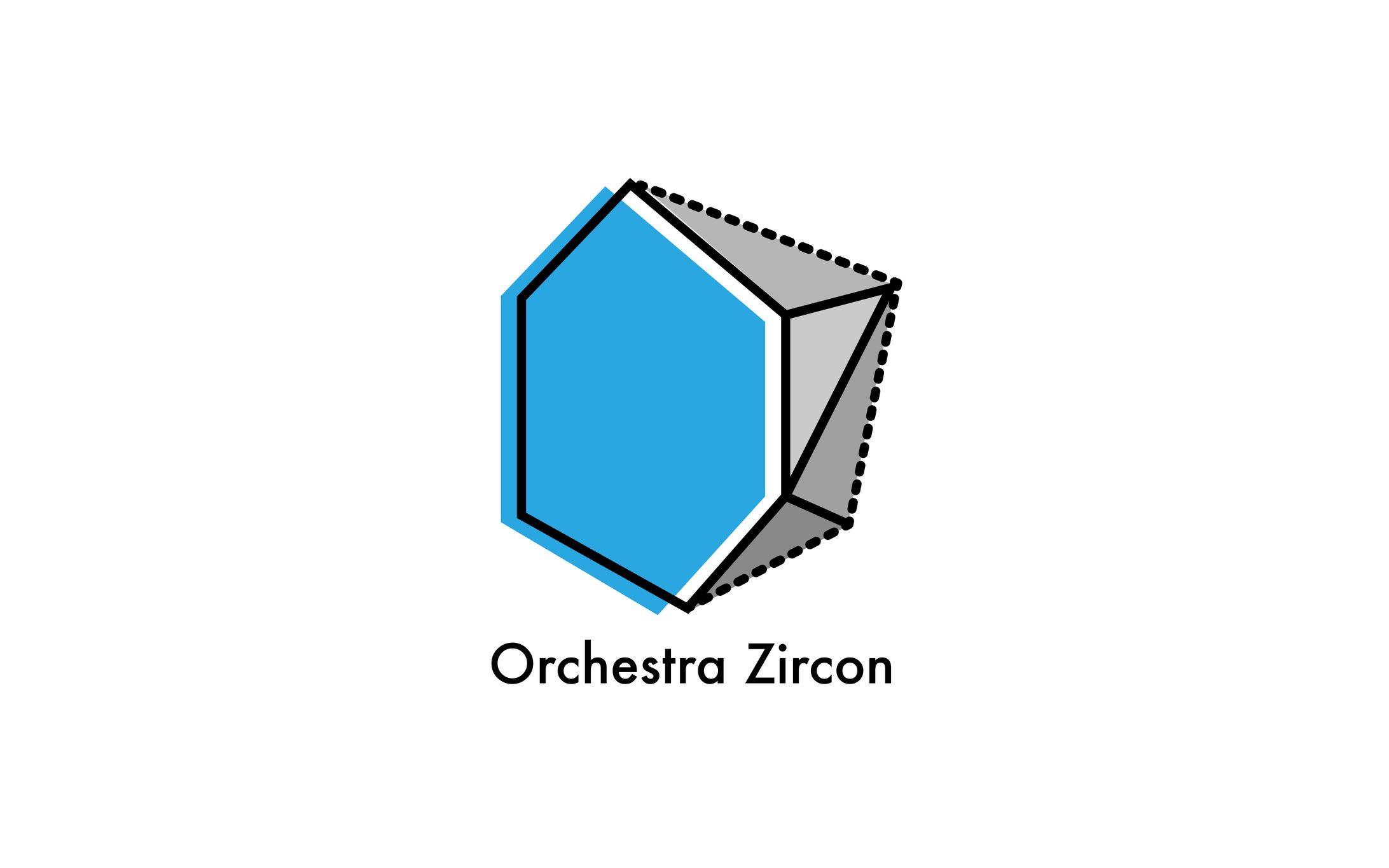
The logo mark, inspired by the image of a raw gemstone, is composed of the alphabets O and Z.
--------------------
オーケストラ立ち上げ時からロゴやフライヤーを始め パンフレット等デザイン全般を担当した。
「多彩な色を持つ宝石ジルコンのようにメンバーの個性 を活かし、色鮮やかな演奏を届ける」というオーケス トラのコンセプトを表現するためロゴの色は規定せず、 その時々で色の変化する自由度の高いロゴデザインを 作成した。
宝石の原石をイメージしたロゴマークはアルファベッ トの O と Z で構成している。
クレジット
デザイナー
イラストレーター


あなたのforiioを無料で作成
Branding design : Orchestra Zircon
I was in charge of designing all aspects, including logos, flyers, and brochures, from the inception of the orchestra.
To express the concept of the orchestra, which aims to deliver vibrant performances by leveraging the individuality of its members like the diverse colors of the gemstone zircon, I created a logo design with high flexibility in color variation, without specifying preset colors for the logo.
The logo mark, inspired by the image of a raw gemstone, is composed of the alphabets O and Z.
--------------------
オーケストラ立ち上げ時からロゴやフライヤーを始め パンフレット等デザイン全般を担当した。
「多彩な色を持つ宝石ジルコンのようにメンバーの個性 を活かし、色鮮やかな演奏を届ける」というオーケス トラのコンセプトを表現するためロゴの色は規定せず、 その時々で色の変化する自由度の高いロゴデザインを 作成した。
宝石の原石をイメージしたロゴマークはアルファベッ トの O と Z で構成している。
クレジット
デザイナー
イラストレーター